71430
•
22-minute read


For the past few years, Google has been shifting its focus to mobile search.
As of now, it’s known for sure that 70% of the whole web is on the mobile-first index.
In terms of SEO, this means that Googlebot indexes the mobile version of your site instead of the desktop site. Thus, if your site isn’t mobile-friendly, chances are it won’t see high search rankings, or worse, your rankings may suddenly drop.
So, how do you make your website mobile friendly so that both your users and Google crawlers will absolutely love it? Let’s have a look!
Mobile SEO stands for mobile search engine optimization. At its core, this is the process of optimizing your website for users who use smartphones, tablets, or any other mobile device to access your site.
The goal of mobile SEO is to provide an exceptional website experience for all mobile users regardless of the screen size, device’s operating system, or mobile internet speed.
Billions of users choose their smartphones over desktop computers daily when they need to catch up with the latest news, check the winner of a football match, or shop online.
While the benefits of mobile SEO may be obvious, I’ve put together some of the most convincing points below.
Back in 2017, mobile searches exceeded desktop Google searches. Today, more than half of all web searches come from mobile devices. As the share of mobile device traffic keeps growing monthly, this trend will only strengthen.
For website owners, this means that a huge part of visitors is viewing their sites from mobile devices. And if the site isn’t mobile-friendly, mobile searchers will bounce back to the search results. Google captures user behavior and may eventually downrank such sites. Chances that bounced users will ever visit badly optimized sites again are low, too.
It all started in 2015 when Google rolled out its mobile-friendly update.
With the so-called “Mobilegeddon” update, Google penalized websites that were not mobile-friendly. However, this applied only to mobile search, which share was much lower than desktop at that time.
This changed dramatically when we first heard about the mobile-first index. Starting in 2017, Google slowly began to crawl the web using the smartphone Googlebot. Fast forward to 2022 and we’re having 70% of the whole web on the mobile-first index. And it keeps extending to finally reach 100%.
What does this mean for website owners?
In short, only the mobile version of your web page is now used for indexing and ranking purposes, which makes mobile SEO important for any website owner.
Here are some visuals to help you better understand how mobile-first indexing actually works:
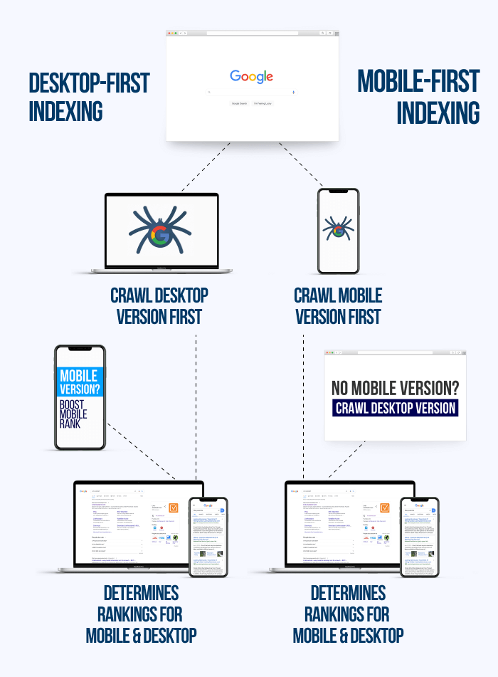
And here is a short video straight from Google explaining what mobile-first indexing is:
The conclusion from the above – Google’s preference is given to sites that are mobile optimized. We’ve once again seen the proof of it when the Page Experience update rolled out.
Wondering if your site is on the mobile index? There’s a quick way to check this using Google Search Console (GSC). Just head over to Settings and check the About section. You'll see Googlebot Smartphone as an indexing crawler.
Note that all websites that went live after July 1, 2019, are indexed with the help of Googlebot Smartphone.
If you’re still on the desktop index, things are likely to change anytime soon, so it's better to take care of your mobile SEO now without putting it off.
When you decide on a long-term mobile SEO optimization plan, Google offers three mobile configurations you can choose from.
To help you choose the right configuration, I’ll briefly describe all three, stating the pros and cons of each.
Mobile responsive design is the most elegant solution in terms of mobile SEO and is recommended by most popular search engines like Google.
Briefly, you have the same URL for all web pages for both desktop users and mobile visitors. The HTML stays the same, too. The only thing that changes is the CSS, which alters the rendering of your content depending on the screen size and device type.
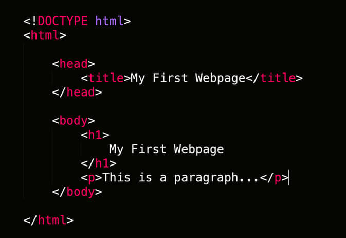
HTML (the Hypertext Markup Language) and CSS (Cascading Style Sheets) are the two major building blocks of any webpage.
I’m sure you’ve already seen pieces of HTML looking like this:
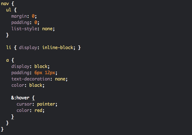
And CSS looking like this:
In plain terms, HTML is used to describe the structure of your webpage.
CSS tells browsers how to present your page including colors, layout, and fonts, as well as allows you to adapt your pages to different screen sizes, device types, and operating systems.
To have full control of how your site looks on various devices, you’ll want to use media queries. The @media rule basically tells browsers how to render your website when certain conditions are met.
Here's one of the basic media queries – if the width of the screen is 800 pixels or less, the background color will change to black :
@media only screen and (max-width: 800px) {

  body {

background-color: black;

  }

}
With a responsive website, all your pages will look great on any device, with minimum effort and time spent.
Have a look at how link-assistant.com is displayed on three different devices – iPhone, iPad, and desktop:
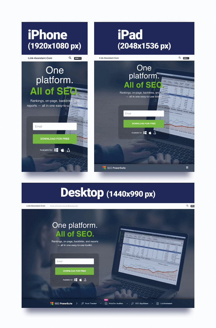
You can easily check how your website is displayed on different devices, too. If you’re using Google Chrome, right-click anywhere on your page, and hit Inspect. In the top left corner of the screen, find Dimensions and pick the device you want to see your site on.
Alternatively, you can leverage a few free online tools. I like this one.
Last but not least, many modern solutions for building a website can help you set up a responsive website without any coding experience.
To summarize, here are the pros and cons of a responsive web design for mobile SEO.
Another way to make mobile-friendly websites is to serve your content dynamically.
With this configuration, the server responds with different HTML (and CSS) on the same URL depending on which user agent requests the page (mobile, tablet, or desktop).
Here’s how it works:
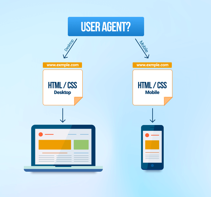
This method is more time-consuming as you have to create two versions of a webpage for the same URL. Plus, you have to keep up with the latest gadgets that are being released. If you don’t, the desktop version of your site will be loaded on newer mobile devices.
Overall, dynamic web serving is less preferable when it comes to mobile SEO:
This approach lies in creating a separate mobile-friendly website for mobile visitors.
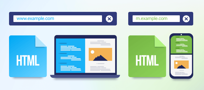
Mobile traffic is redirected to another, mobile-specific URL, which typically looks like this – m.example.com. As a rule, this version of a site has less content than the desktop one and offers navigation that's better suited for mobile browsing.
This mobile configuration was popular back in the day, but today it’s not used that often and is not recommended by Google.
Here’s Google’s take on this:
If you choose this mobile configuration, you’re likely to see serious troubles with duplicate content, which can hurt your site’s SEO. Also, you'll want to optimize titles and meta descriptions so that both versions of a single page have the same title and meta descriptions. What’s more, HTML and CSS allow us to do unheard-of things with websites today, so a responsive solution is preferred.
A separate mobile app (for iOS and Android users) is an extra option, which can complement your mobile-friendly website or serve as a standalone solution.
It’s important to understand that not every business needs an app.
Say, if your website is purely informational, you’ll be good to go with making your website responsive for mobile visitors. When it comes to building responsive websites, exploring the best responsive website builders can significantly simplify the process and enhance the user experience. But if you’re running an e-commerce site or food delivery service, an app can significantly boost your users’ mobile experience.
But…
Building an app is a serious headache if you don’t have a solid technical background or a massive budget. It’s a costly solution, and often can be replaced with a properly optimized responsive site. So unless you’re a big brand, an app is not something you should spend your money and time on.
Summing it up, Google and other search engines recommend that you use a responsive layout for your mobile-friendly site today. But the choice is always up to you and your business needs.
To help you revise all three mobile configurations, I’ve made this handy infographic:
First things first. Before you start making your existing website mobile-friendly, check what’s your status quo at the moment.
Jump to GSC and head over to the Mobile Usability tab.
The tool will let you know if you have any serious issues with your site’s mobile SEO. And if you jump to the Details section, you’ll see a short description of what Google believes to be hurting the usability of your site for mobile visitors. This includes user experience issues, problems with your mobile site’s interface, and a slew of other factors you’ll be working on later in this guide.
If you don’t have a GSC account, you can also check your site’s mobile optimization using Google’s Mobile-Friendly Test.
Enter your site’s URL, hit Analyze, and wait till the tool collects all the data.
The only drawback is that you can analyze only one URL at a time. So if you need to audit the entire website, it’s better to use Google Search Console.
Alternatively, you can check your pages' mobile-friendliness with WebSite Auditor. Launch the tool, and go to Page Audit > Technical Audit. Enter the URL you want to examine and a few keywords describing the page. Once the check is finished, you’ll see the results and a detailed breakdown of the factors that need improvement.
Download WebSite AuditorBefore we jump to page speed optimization on portable devices, let’s see how you can measure this factor first.
This can be done in a few ways – with the help of WebSite Auditor and Google PageSpeed Insights.
WebSite Auditor allows you to check all your web pages in bulk. There you can go to Site Structure > Site Audit and get a bulk page speed report for your entire website as well as view all affected pages — all from a single dashboard:
Download WebSite AuditorOr you can switch to Site Audit > Pages > Page Speed and view a list of pages opposite speed issues that affect them. Click on any page and you’ll also get a list of page elements that can be optimized for better performance:
Download WebSite AuditorAlternatively, you can use Google PageSpeed Insights. Once you’re there, enter the URL of a page you want to check and wait till the analysis is finished. Scroll down to the Opportunities section and see the suggestions that will help improve your website speed.
The disadvantage of this method, as you might guess, is that it only allows you to examine one page at a time, which can be tiresome.
There’s another Google tool to check your website speed on mobile – Mobile Speed Test. The cool thing about it is that you can see how fast your webpage is loaded from different locations, and on different mobile networks (3G/4G).
Ready to step into 2023 with a mobile-friendly website that is perfectly optimized?
In this section of the guide, I’ll describe four steps to make your site mobile-friendly, both in the eyes of users and Google.
How fast your site loads on mobiles is crucial if you want to boost your mobile SEO.
One of the studies cited in Google’s blog post revealed that mobile users tend to keep their attention on the screen only for 4-8 seconds at a time. If your web page takes longer to load, you’re losing a ton of visitors, literally.
Check these statistics from Google:
When it comes to the search and ranking algorithms, the Page Experience update and the introduction of Core Web Vitals (CWV) once again emphasized the importance of shorter load times for mobile visitors.
Core Web Vitals are the metrics that measure loading speed, interactivity, and visual stability on your website. Together with mobile-friendliness, safety, security, and the lack of pop-ups, these new signals are now used to assess the overall page experience and to cast a final vote in deciding whether a page is worth ranking. Here’s a detailed guide from Google.
We've also found some convincing correlation between improved Core Web Vitals and organic impressions and clicks. Make sure to check our Core Web Vitals case study to learn more.
Google’s benchmark for mobile page speed is one second. While this may seem quite ambitious, this goal is attainable.
Here are the exact steps you need to take to guarantee shorter load times on mobile:
Much of the success with your loading times depends on how fast your web hosting server is.
If your server takes too long to respond, you’ll see a corresponding alert in PageSpeed Insights. You’ll want to talk to your web hosting provider’s support to discuss possible ways to speed things up. Consider out to trying some of the best VPS hostings to seamlessly increase your websit response time.
Adobe Flash was extremely popular in the early years of the internet. But this is no longer true. Especially for mobile devices, which never supported Flash.
If you need to add media to your web pages (videos, animations, etc.) use HTML5 instead not to hurt your mobile SEO. Not only will it help you deliver the same content on all devices, but it will also significantly boost loading times on smartphones, and tablets.
If you're among WordPress users or you're leveraging any other CMS, be extra careful with plugins. They may be slowing your site.
Do a split test to see how well your site performs with and without plugins. You can also use Query Monitor to detect problematic plugins on your WordPress site.
Every site has a ton of images. To make them all load fast enough, they surely need to be optimized.
Make sure you’re using proper image formats, such as AVIF, JPEG 2000, JPEG XR, and WebP. The latter format is 25% to 35% lighter than PNGs and JPEGs of similar quality, so it can become a major speed booster when it comes to mobile SEO.
To reduce the size of your images even more, run them through compression tools.
Another way to save on loading time is to leverage lazy-loading for images on mobile devices. Lazy-loading allows you to defer offscreen images and load them only when it’s needed.
Here’s how it works:
To avoid indexing issues, don’t lazy-load the mobile content that is above the fold because Googlebot can’t load elements that need user interaction.
Caching speeds up browsing and makes for a good user experience for returning visitors. Allow browsers to cache all parts of your site’s content, including text, images, HTML, CSS, and JavaScript. This should greatly help with your mobile optimization.
A CDN is a network of servers linked together to deliver your site’s content faster. And by saying faster, I mean it.
In plain terms, multiple CDN servers are located all over the globe. When a user from, say, New York, visits your site, a CDN network will find the closest server and load all content from there. No matter where geographically the original dedicated server is.
Many web hosting providers offer CDN at no extra cost.
To keep your site optimized for mobile search and secure fast loading speed on mobile platforms, every single piece of your HTML, CSS, and JavaScript must be perfectly coded.
You can’t build a site without a single redirect. But make sure they are properly set up, and watch out for mobile-only 404 redirects. The general rule of thumb here is the fewer redirects you have on mobile devices, the better.
The AMP project (Accelerated Mobile Pages) is an open-source project largely sponsored and promoted by Google.
You might have seen AMP pages on a SERP.
AMP pages used to have a lightning bolt icon. But recently Google removed the AMP icon for mobile search results. So it’s really hard to tell the difference now.
The major AMP benefit is that your pages load almost instantly but this boost in speed comes at a price.
First, there are serious web design restrictions. You can only use inline styles, CSS is limited to 50KB, and JavaScript to 150KB.
Second, when someone links to your AMP page, this backlink will point to the google.com domain instead of yours. So link-building gets a bit complicated with AMP pages.
Lastly, if your mobile webpages are properly optimized, you can reach AMP-like mobile loading speed without actually implementing AMP.
We have a detailed guide on AMP, make sure to check it to see all the pros and cons of this technology.
That’s pretty much it. If you want to dig deeper and find more ways to optimize your website’s loading speed for better mobile SEO, check this ultimate guide and watch this short video on checking core web vitals in WebSite Auditor.
If your website has been switched to mobile-first indexing, you’ll want to make sure that the mobile version of your site has the same content as desktop. This includes Javascript, CSS, images, and other important pieces of your site’s code.
As you already know, it’s the mobile version of your site that is indexed and ranked. So if any parts of your content are blocked on mobile, Google simply won’t see them and they won’t get indexed. By the way, we have a dedicated guide on how to fix Google's most common indexing issues.
If you still need to hide any parts of your pages’ content for mobile users, you can put them in tabs. Before the world heard about the mobile-first index, this might have been an issue and could hurt your rankings, but it’s no longer true, and Google confirmed that.
Additionally, if you have a separate site for mobile visitors (m.example.com), you need to check and compare both versions of your robots.txt file – for desktop and mobile.
A robots.txt file is a text file that tells search engine bots which pages or files from your site they can or can't visit. To get into more details, check this help article.
There’s a good old way to do this by adding robots.txt after your desktop and mobile website’s URLs – www.example.com/robots.txt and m.example.com/robots.txt.
Check with extra caution that none of your important and money-making pages are blocked from crawling on mobile devices.
If you’re using WebSite Auditor, you can see your website just like a Googlebot Smartphone crawls it. Go to Website Auditor > Preferences > Crawler settings > Follow robot.txt instruction for Googlebot-Mobile.
Mobile website’s user experience differs from desktop in many ways.
As a rule, there’s a smaller size of the screen, and the browsing is primarily done in portrait mode. While a responsive layout covers many of these aspects, you should mind that having a responsive site is not always enough in terms of mobile UI optimization.
Let’s walk through the main action steps you can take to level up the mobile experience for your visitors and ensure your website is mobile-friendly.
A simple but often overlooked part of making a website mobile-ready is the “Viewport Content” tag.
The viewport meta tag tells browsers how to handle the dimensions and scaling of your webpage on different devices.
Google’s recommendation is to use the viewport tag as follows:
<meta name="viewport" content="width=device-width, initial-scale=1.0">If you’re using a responsive design, always double-check that your HTML contains a properly formatted “Viewport Content” tag. It will help you avoid your site showing up as а desktop on a mobile phone.
Always think small screen when you’re picking font sizes and colors.
Apply simple clear fonts with the size of at least 14px. Make sure there’s enough contrast between text and background to avoid readability issues in problematic surroundings.
Also, try not to overwhelm mobile users with lengthy text blocks on the top of your landing pages – use short paragraphs instead, and move the text that isn’t critical to the bottom.
Here’s a good example from The New York Times.
While their desktop version is heavy with lots of text and images, their mobile version is light and easily readable with one featured article at the top:
Doubt your website is easily readable? Just take your smartphone and browse it for a few minutes. Have you had to zoom in to read any parts of your content? If the answer is no, then the readability of your mobile website should be fine.
You can also jump to Mobile Usability in Google Search Console to check if your mobile responsive website has any readability issues, which may be hurting your website's mobile SEO.
When you’re optimizing your site for mobile devices, you’ll want to make the whole design “thumb-friendly”.
Take a look at this:
In 49% of cases, it’s a thumb that is used for interacting with content. Hence, all tappable elements on your mobile website should be of enough size to fit the size of a thumb. This also applies to the distance between clickable links in your text.
Google recommends a minimum tap target size of roughly 7mm or 48 CSS pixels, with a minimum spacing between elements of at least 8px.
There’s a quick way to check if your site meets these criteria with the help of Google’s Lighthouse (available in Chrome browser).
To do this, open the page you want to examine in the browser, right-click anywhere on the page, and hit Inspect. You can also press Shift + CTRL + J (Windows), or Option + ⌘ + J (on macOS).
At the top right corner of the screen, find and click the >> symbol and choose Lighthouse.
You’re almost there! Hit Generate report and wait till the check is finished.
A familiar report we’ve already seen in PageSpeed Insights will be generated, but we’re particularly interested in what the SEO section tells us.
In case any of your tappable elements fell out of Google’s recommendations, Lighthouse will give you a warning, as well as it will tell you exactly what hurts your mobile SEO and needs fixing.
Your mobile-friendly navigation can take many shapes but you should always remember that it must feel natural and intuitive to users. Once people land on your homepage, they should perfectly understand where and why they need to go next.
Here are a few tips to make your mobile navigation perfect:
Keep it simple. Remember mobile users get easily overwhelmed? This applies to navigation as well. Your menu should be designed with small screen sizes in mind. So instead of cluttering it with lots of elements, you’ll want to analyze your typical users’ journey and limit your mobile navigation to the 4-8 most vital items.
Check these mobile menus from Flyus and Apple for inspiration:
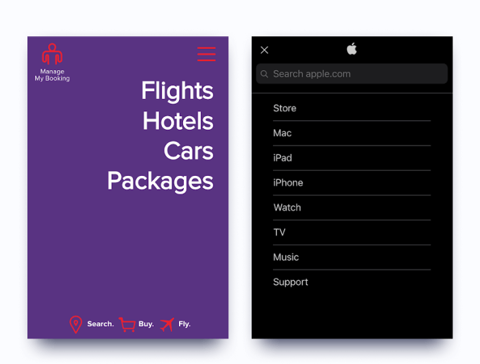
Prioritize important elements. Since mobile users’ attention span is really short, you’ll want to bring your most important items, such as money-making pages and calls-to-action, to the very top.
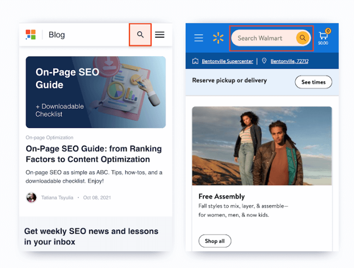
As a rule, mobile website visitors engage with the content on your site more eagerly than on desktop. But surprisingly, the mobile conversion rates are way lower according to various research studies. So why is this so?
I’ve done my own check and found out that many landing pages often have the same problem. And that’s a misplaced call to action.
Have a look at these landing pages:
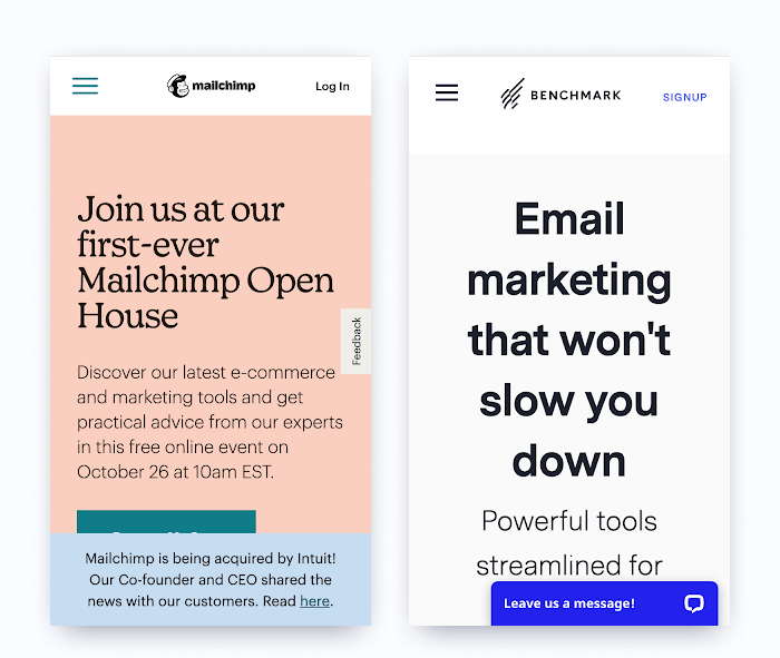
In the first case, I can’t join the online marketing event before I scroll down – the banner overlays the CTA, and there’s no way to close it. Mailchimp is likely missing out on a big part of mobile website traffic on this page.
With Benchmark’s landing page, I had to scroll four or five times before I finally saw their CTA button. I’m 100% confident their conversions would skyrocket if they followed a basic mobile SEO tip…
Always place CTAs on your money-making pages above the fold for mobile users. Don’t force them to scroll to find it, never let not-so-important banners overlay CTAs, make the CTA’s text clear, and don’t forget that the button should be designed with the thumb-first approach in mind.
Here are some good examples of a properly placed CTA on a mobile device:
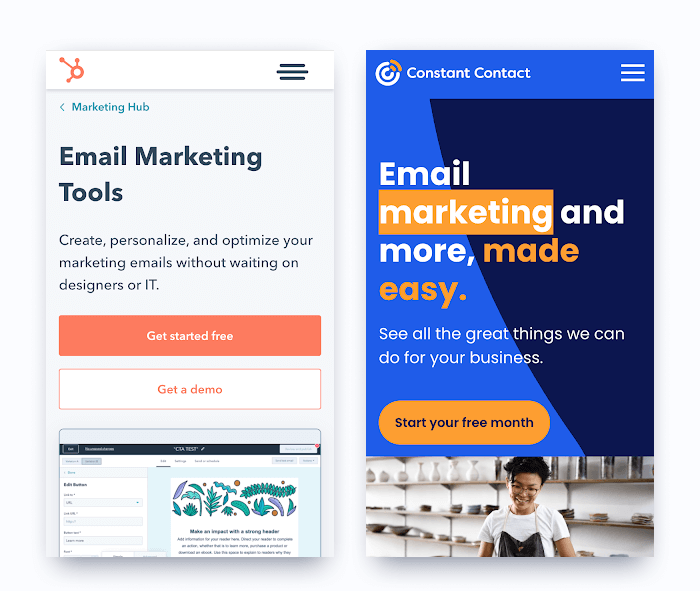
See the difference?
Adding social sharing buttons to your site is always good. They let users easily share your content in their social profiles, boosting your brand exposure and helping you reach more people online.
The social sharing widget is typically placed on the left/right side of the screen for desktop users so that they can share your content once they decide to do so.
However, this placement is not so good for mobile devices because the browsing happens in portrait mode.
But…
You can still leverage social sharing buttons on the mobile version of your site without hurting your mobile SEO. You just need to use a tab view and place the widgets, say, at the bottom of your page. Take a look:
Many website owners think of a pop-up as an extra way to collect more leads, email subscribers, or to get more visitors to register for an online event. At the same time, both users and Google consider pop-ups a UX nightmare in the majority of cases. And this is particularly true for mobile devices.
With smaller screen sizes on mobile, a pop-up that is fine for desktop can hamper the view of the target content and look not exactly the same as you want it to be.
Take a look:

Such pop-ups will not only ruin your mobile user experience but can also hurt your rankings. Google confirmed this a long time ago.
So does it mean you can’t use pop-ups at all? Not actually.
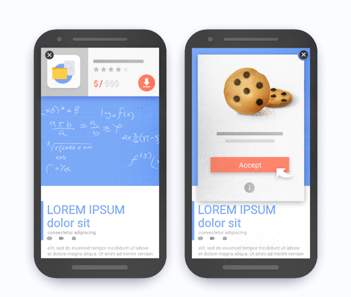
To avoid penalties from Google, you need to use any pop-up responsibly and make sure they are not hiding the background content completely.
So instead of using pop-ups like these:

You’ll want to go with pop-ups looking like this:
Schema markup is a set of HTML tags used to help Google’s crawlers better understand what your content is about. You can choose from hundreds of different tags and use them to mark content on your site (phone numbers, working hours, recipe cooking times, product prices, etc.).
Sites with properly structured schema markup are better interpreted by Google and have all chances of getting these beautiful rich snippets on mobile search engine results pages:
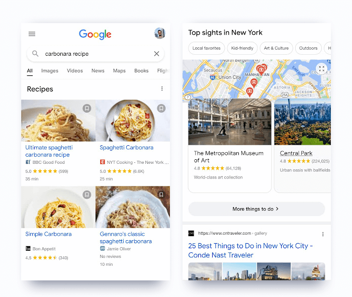
Apart from looking gorgeous, these rich snippets typically take the top of Google’s search results. You can imagine how this influences click-through rates.
Ready to give it a try? Here’s how:
If you're running a WordPress website, you need to use specific plugins offering structured data optimization.
Out of many ways to implement Schema markup, there’s one I prefer most – Google’s Markup Helper. It’s simple, automated, and the whole process doesn’t take much time.
Once you’re in the helper, just pick the type of content you’ll be working with, add your URL, and hit Start Tagging.
On the next screen, you need to highlight the elements of your web page and specify what they are.
Once you’ve finished tagging, click CREATE HTML. You’ll get the code that needs to be added to the head section of your page.
As soon as you’ve uploaded your page and it’s live, check if everything works fine.
Go to the Rich Results Test and check if your page is eligible for rich results.
That’s it!
As we all live in the mobile-first world, mobile SEO is an absolute MUST today. While it doesn’t take much time and effort, the benefits of mobile SEO are huge and include better user experience on mobile devices, higher rankings, and conversions.
Make sure to follow all the best practices listed in this guide, and the results of your mobile SEO efforts won’t take long to notice. If I missed something or you just want to share which mobile SEO tips worked best for you, don't hesitate to drop a comment in our private Facebook community.